FARFETCH: Improved the Size & Fit section to make it easier for customers to choose the right size without guessing. This led to more items added to the bag (+0.9%) and fewer returns (-1.3%).
Size scale conversion
Farfetch is a global e-commerce marketplace for luxury fashion, connecting brands and boutiques to customers worldwide. As part of the shopping experience, users browse products from a wide range of creators and markets, each with their own sizing standards.
BRIEF
When shopping online, customers often struggle to choose the right size. Farfetch aggregates over 300 different size scales of luxury brands, each using different sizing standards (US, UK, EU, IT, etc.), making size selection confusing and inconsistent. Sizing issues are the leading cause of product returns:
62% of returns were due to Size & Fit.
I led the design of a new size selection experience that surfaced familiar sizing scales based on user location, reducing friction and increasing confidence. We ran A/B tests to validate our hypotheses and guide product decisions based on user behavior and return data.
The solution resulted in a +0.9% uplift in add-to-bag rate and a 1.3% drop in return rate.
CHALLENGE
What if choosing the right size wasn’t a struggle?
Our main goals were to:
• Reduce friction and hesitation during size selection
• Increase customer confidence before purchase
• Lower return rates caused by Size & Fit issues
MOTIVATION
Bracketing, when customers order multiple sizes to try at home and return the rest, was driving high operational and financial costs at Farfetch. While free returns encourage this behavior, it significantly impacts profitability and logistics.
By increasing confidence in size selection, we aimed to reduce bracketing at the source and minimize unnecessary returns.
MY ROLE
I led the UX strategy and design of an improved size selection experience, aiming to reduce friction caused by inconsistent size scales across brands and markets. I partnered with product and data teams to investigate user behavior and return patterns, define hypotheses, and translate them into testable design solutions.
We ran two consecutive A/B tests, each based on a different hypothesis.
The second test was built on insights from the first, allowing us to iterate quickly and evolve the solution based on measurable impact and user feedback.
I collaborated closely with engineers to ensure feasibility across our multi-brand platform and monitored results to guide future iterations. My focus throughout was on using design as a strategic tool to build trust, reduce returns, and improve conversion.
THE PROBLEM
Scales guide choices, but not always effectively
Luxury brands on Farfetch use over 300 different size scales, which are defined by the partners during product creation, regardless of the user’s location or size preferences. This inconsistency forces users to convert sizes manually, often relying on the size guide or even leaving the product page.
Sizing confusion leads to friction and returns:
• Difficulty in purchasing clothes and items online without trying on
• Lack of standardized sizing information leading to confusion and inefficiency
• High return rates due to sizing issues
• User frustration from not knowing the exact fit of the items
“I don’t know what a US size 9 converts to. I had to scroll through the product info just to figure that out.”
User
(Usertesting.com)
“I was frustrated to see the size in Italian. Then I had to open the size guide to figure out the UK equivalent.”
User
(User interview)
“I didn’t even notice there was a size guide. I just assumed my size wasn’t available.”
User
(User interview)
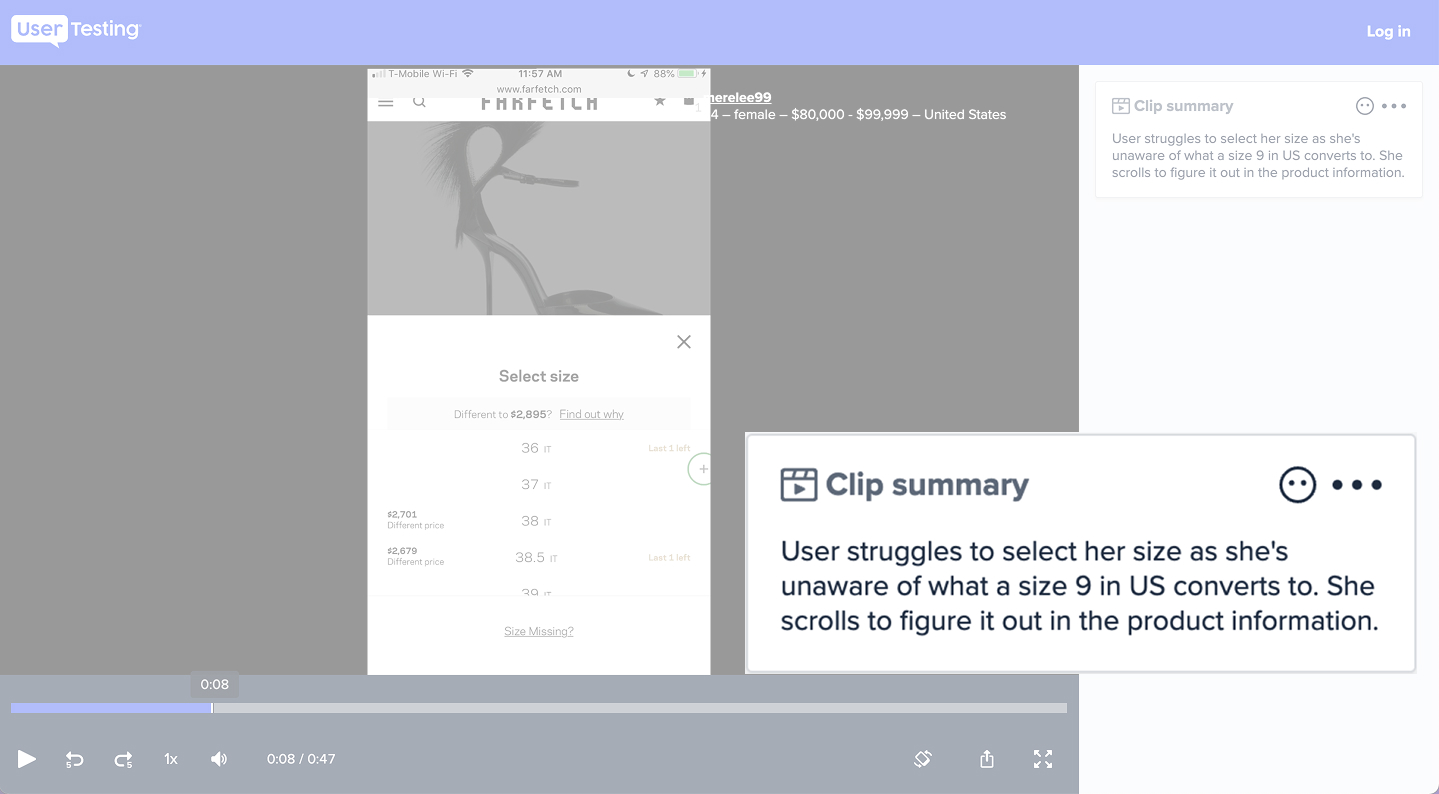
User testing insight
KICKOFF
Before jumping into an A/B test, we analyzed the return rate performance of each size scale across our top 10 markets. We wanted to ensure that converting unfamiliar sizes wouldn’t negatively affect return rates, especially since size & fit issues were already the primary driver of returns.
What we found surprised us:
The best-performing sizing scale across countries and clothing categories was the Clothing Standard scale (S/M/L).
• 8.9% lower return rate for Menswear
• 8.5% lower return rate for Womenswear
However, country-specific scales performed best for shoes, though testing for shoes was placed on hold due to technical limitations in localizing scale logic across the platform.
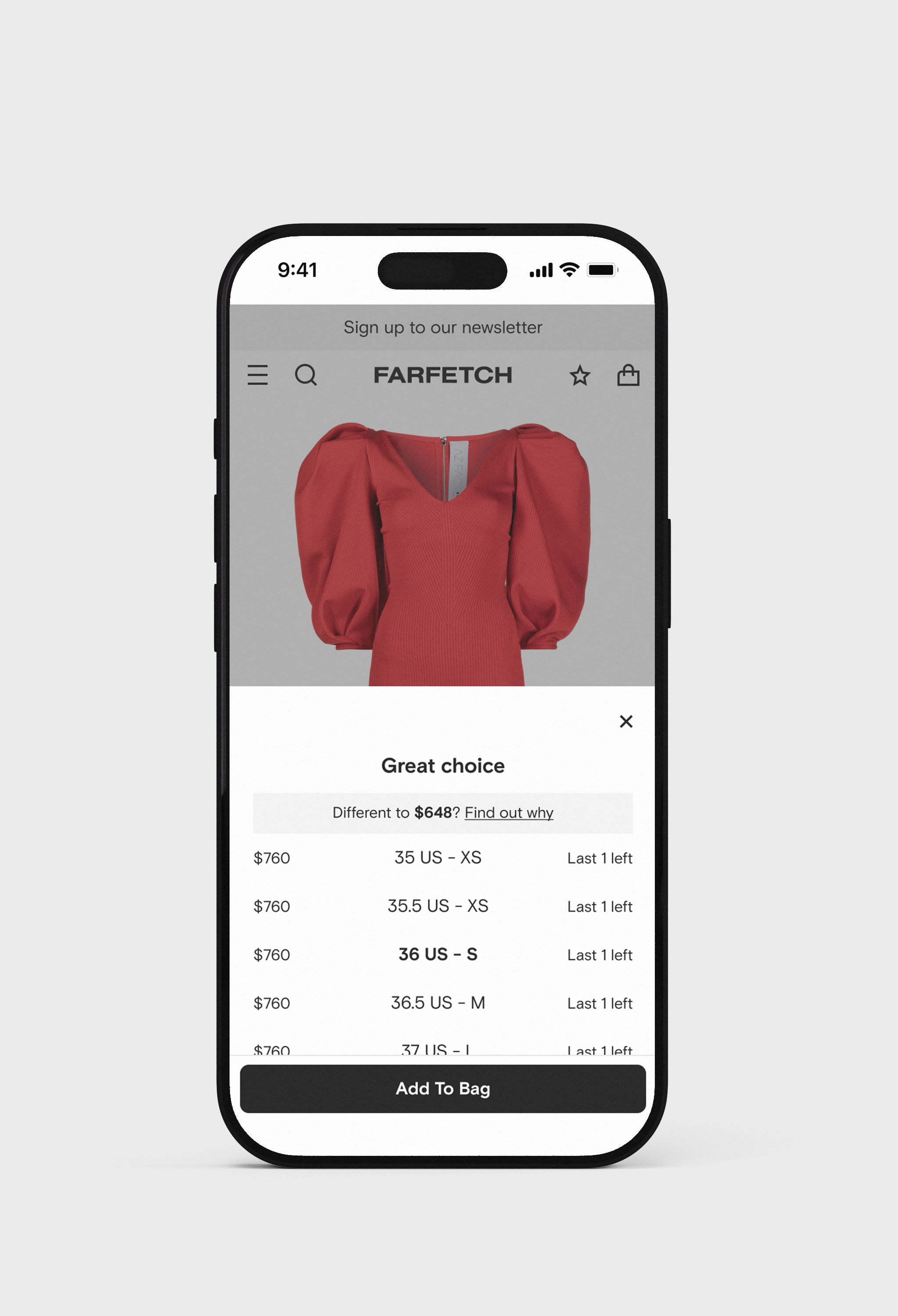
With this insight, we formulated our first hypothesis: showing only the converted scale
HYPOTHESIS 1
We believe that displaying a size scale familiar to the user will result in higher customer confidence to select the correct size

Given the complexity of redesigning the entire size selector to support all information and scales, we tested our hypothesis with low effort and minimal risk by converting all product sizes with 1:1 mappings to the Clothing Standard scale (S/M/L) and only in the Product Details page dropdown. The interface remained visually unchanged, and the difference was the scale displayed. This test ran on the web for all resolutions.
Results
add to bag rate
+0.5%
return rate
-0.8%
Results
add to bag rate
+0.5%
return rate
-0.8%
Learnings
Despite the uplift, we hit two major blockers:
• Users were confused by size inconsistencies between the Product Details and Shopping Bag pages
• Brands pushed back, arguing that the removal of their original size scales harmed brand perception
These insights led us directly to our next iteration: dual scale (original + converted)
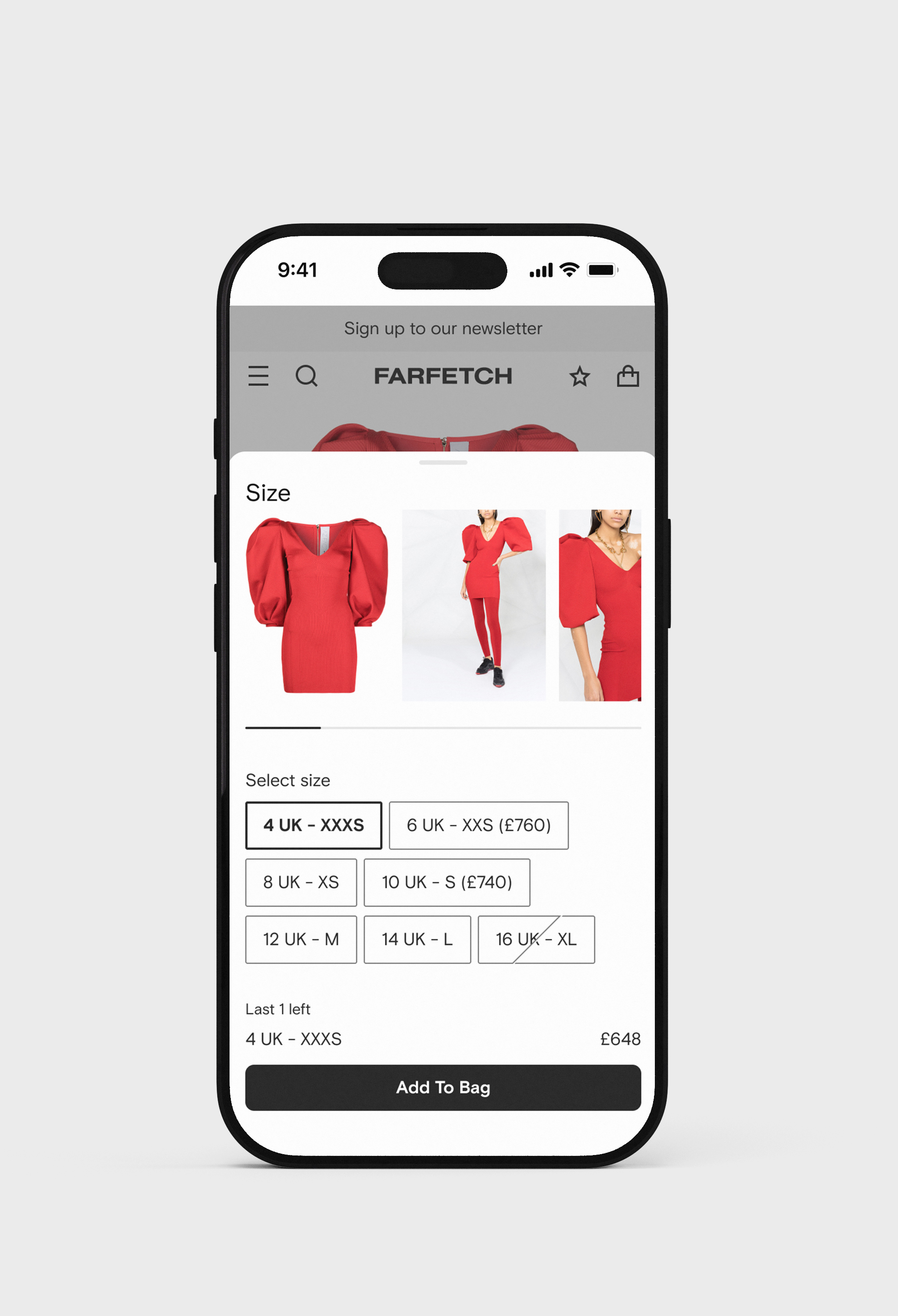
HYPOTHESIS 2
We believe that displaying the brand size scale and the converted scale together in the size selector will result in higher customer confidence to select the correct size
To support this iteration, we made subtle visual adjustments to the size selector, integrating the original and converted size formats without compromising clarity. This was especially important given the amount of existing information already present in the component, such as messages about unisex sizing, price differences, sales, and stock availability (e.g., “last 1 left”).
We intentionally kept the layout lightweight and familiar to avoid cognitive overload and maintain scalability across screen sizes.
Constraints
• Some edge cases, like Mid-standard scales (e.g., XXS/XXXS), were excluded from this A/B test, as they would break the design and add unnecessary visual noise
• The selector was already under pressure from multiple ongoing initiatives, so our goal was to introduce this improvement with minimal disruption to the existing experience
Results
add to bag rate
+0.9%
return rate
-1.3%
Results
add to bag rate
+0.9%
return rate
-1.3%
REDESIGN OF THE SIZE SELECTOR
Explorations
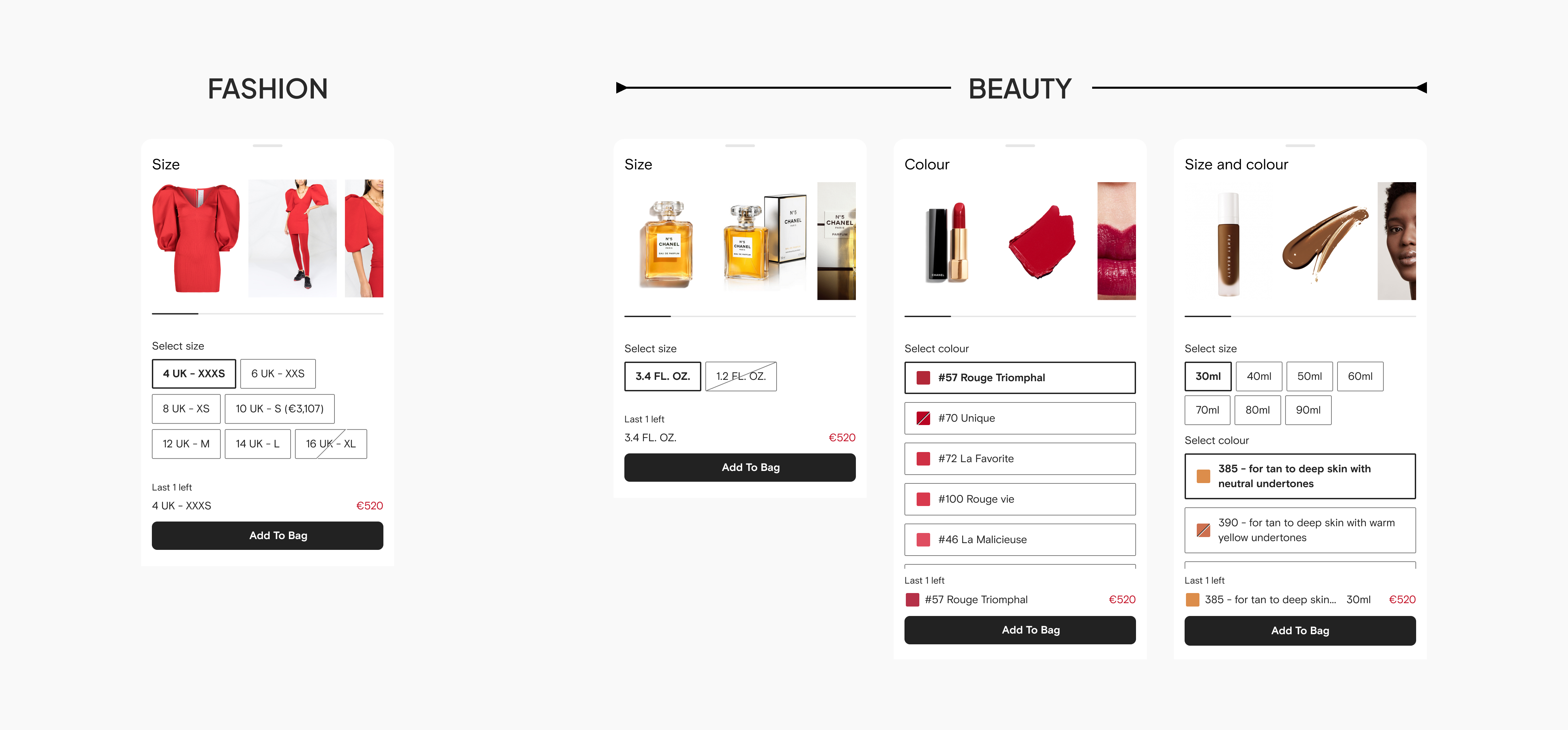
Encouraged by the strong results of the dual scale test, I initiated a full redesign of the size selector, not only to scale the solution across Fashion, but also to future-proof the component for other business models like Beauty, which was being introduced in parallel and required new selection types such as color and color + size.
As part of this effort, I explored multiple layout variations to optimize clarity, responsiveness, and adaptability across categories and screen sizes.
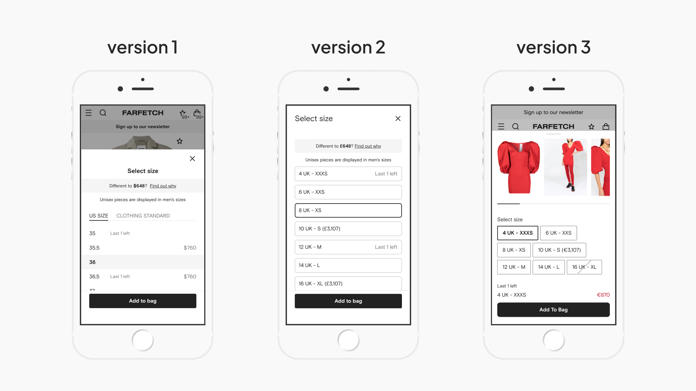
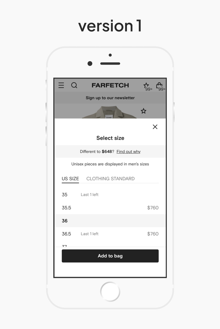
Version 1: Tabs
Tabs to separate original and converted scales, reducing visual noise and focusing user attention
Pros: Cleaner presentation, focused view per scale
Cons: Low engagement with tabs on our platform since our users rarely click them, risking discoverability
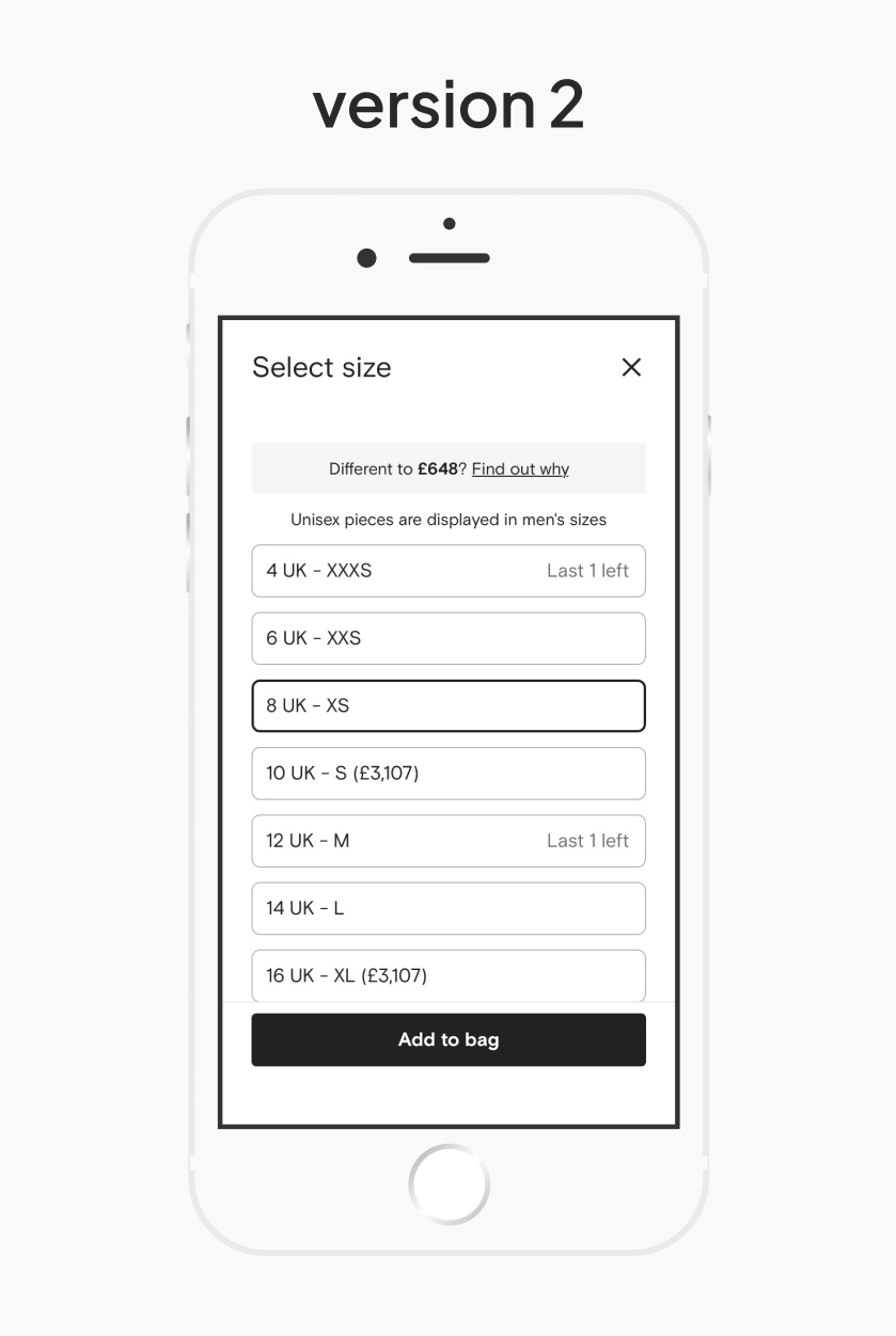
Version 2: Full-width chips
Both scales into a single line (e.g., “8 UK – XS”), using full-width chips along with other messages (e.g., “Last 1 left”)
Pros: Clear side-by-side comparison and familiar interaction pattern
Cons: Created unused visual space, and required effort from the Design System team to implement
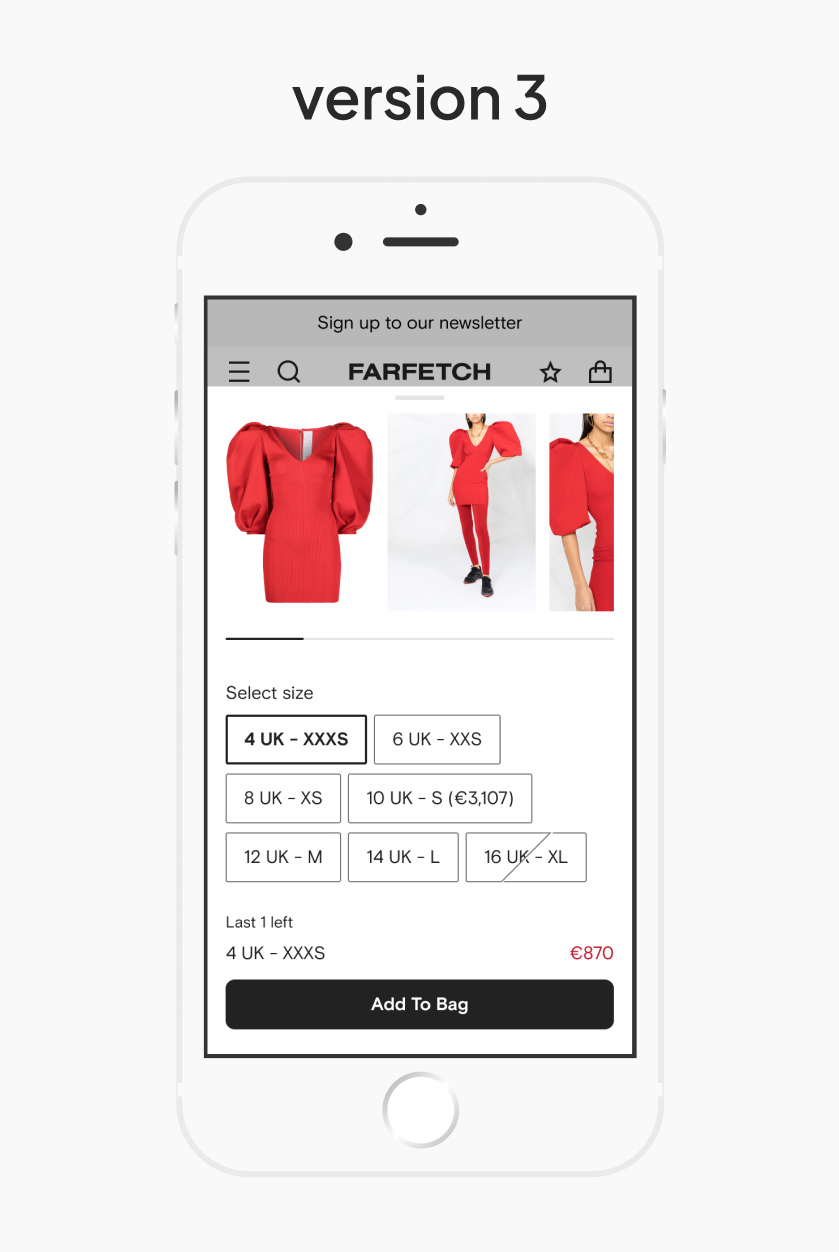
Version 3: Choice chips / Grid layout
Quick-scan layout that supported touch interaction and was easier to scale across mobile and desktop
Pros: Faster readability and better support for hybrid selection (e.g., size + color)
Cons: Required more effort from the Design System team to implement a new, flexible component
Version 1: Tabs
Tabs to separate original and converted scales, reducing visual noise and focusing user attention
Pros: Cleaner presentation, focused view per scale
Cons: Low engagement with tabs on our platform since our users rarely click them, risking discoverability
Version 2: Full-width chips
Both scales into a single line (e.g., “8 UK – XS”), using full-width chips along with other messages (e.g., “Last 1 left”)
Pros: Clear side-by-side comparison and familiar interaction pattern
Cons: Created unused visual space, and required effort from the Design System team to implement
Version 3: Choice chips / Grid layout
Quick-scan layout that supported touch interaction and was easier to scale across mobile and desktop
Pros: Faster readability and better support for hybrid selection (e.g., size + color)
Cons: Required more effort from the Design System team to implement a new, flexible component
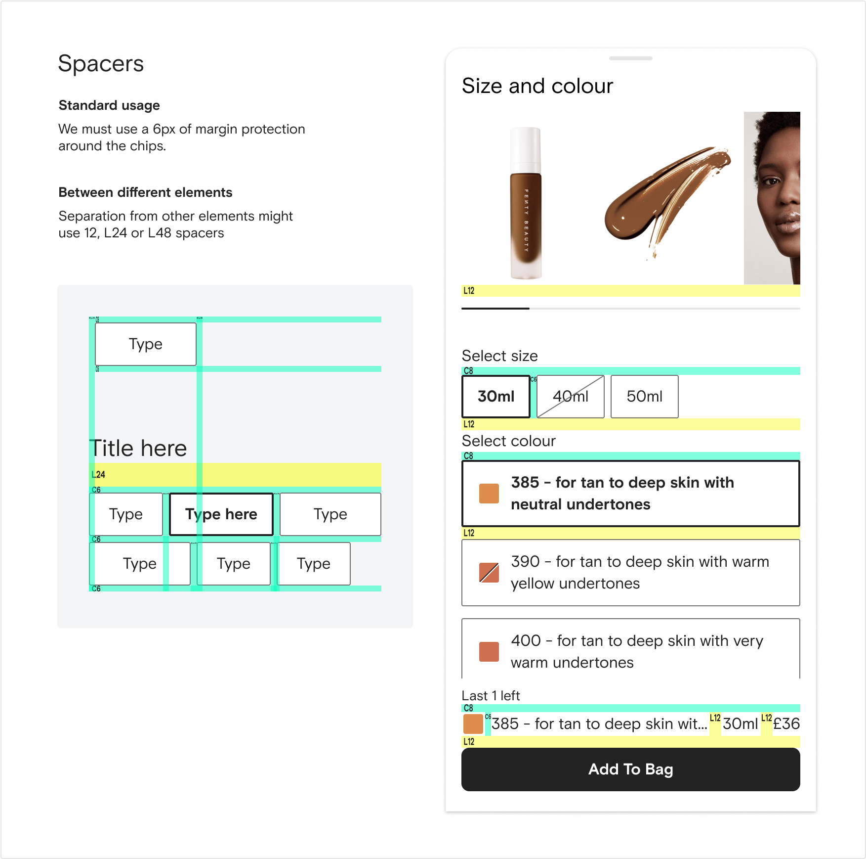
DESIGN SYSTEM
But what challenges did we face along the way?
To support this redesign at scale, I made a new modular component for the Design System that could adapt to different product verticals and interaction patterns.
The new selector needed to support:
• Multiple selection types (e.g., size, color, or color + size combinations)
• Dual labeling for original + converted scale formats
• States for low stock, price differences, and promotion badges
• Responsive and accessible across devices and apps
I contributed design specs, prototypes, and use cases, helping to define the flexibility rules and fallback logic for edge cases, especially for categories like Beauty, which was still evolving during this period.
We aimed to ensure the selector could scale across multiple business models with visual clarity, technical consistency, and minimal implementation effort for future squads.
Examples of the Design System specs documented during the process:


HANDOFF
Every pixel counts
Once the final direction was validated, I documented the solution in detail, including specs, edge cases, responsiveness rules, and fallback logic, and collaborated closely with the engineering team to ensure a smooth handoff.
I designed a flexible selector component that could support multiple use cases across categories, including Fashion and Beauty, and scale to accommodate future business needs.
Although the Beauty vertical was later discontinued and the selector redesign wasn’t fully implemented for Fashion, the hypothesis validated in our second A/B test (dual scale display) remains the version in use.
This was the last project I completed before leaving Farfetch, and I left with the confidence of having delivered a well-grounded, scalable solution with measurable impact and clear next steps for the team. It was a great example of how small, scalable changes, grounded in user insights and data, can unlock business value while simplifying the experience.
FROM HERE FORWARD
What comes next
The AB tests confirmed our hypotheses, and the 3rd version of the explorations, after being validated by the users, was going to be implemented